
Struggling to keep users on your directory site? With over 64% of web traffic coming from mobile devices, having a mobile-friendly website is no longer optional. A mobile-first website builder ensures your directory site loads fast, is easy to navigate, and ranks better on search engines. Here's why it matters:
Fast Loading Speeds: 53% of users leave if a site takes over 3 seconds to load.
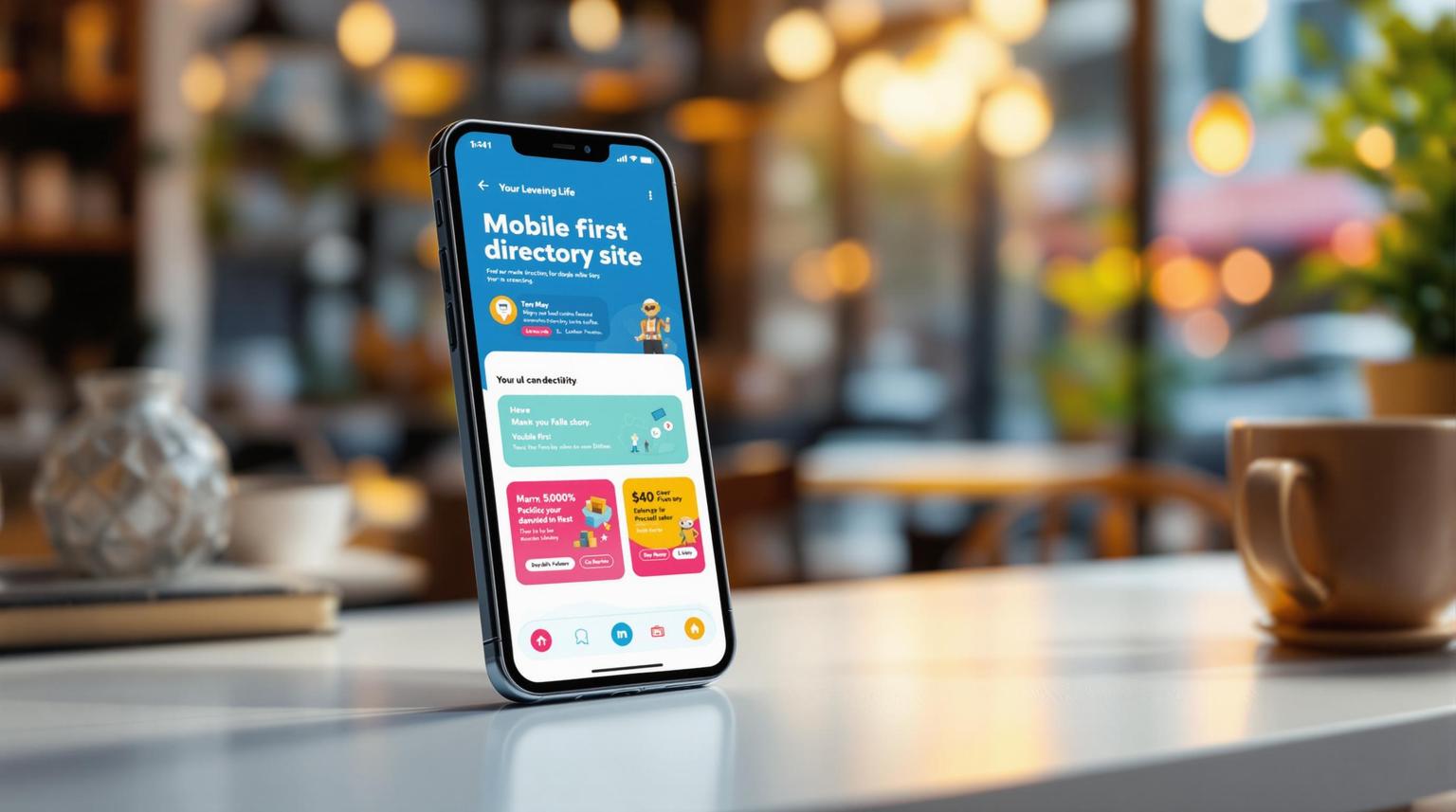
Improved User Experience: Touch-friendly navigation, clear menus, and essential info like maps and contact details make users stay.
Better SEO: Google prioritizes mobile-friendly sites in search rankings.
Revenue Boost: Mobile-first tools support features like premium listings, ad management, and membership tiers to generate income.
Switch to a mobile-first builder like Lideroo to create a site that works seamlessly on all devices and keeps users coming back. Ready to learn how? Let’s dive in.
Problems with Non-Mobile Directory Sites
Speed Problems and User Drop-Off
Non-mobile directory sites often struggle with slow performance, leading to a loss of user engagement. Did you know that 53% of mobile users leave a site if it takes more than three seconds to load? Meanwhile, the average mobile page load time is a staggering 27.3 seconds [5].
Even a one-second delay can lead to:
11% fewer page views
16% drop in customer satisfaction
7% decrease in conversions [5]
"As consumers are becoming more time-poor and attention spans are decreasing, pages that don't load immediately can mean that a customer will refuse to purchase from [that] site." – Daniel Cheung, search engine optimization manager at Optus [4]
Slow speeds aren’t the only issue. Poor navigation design adds to the frustration.
Difficult Search and Menus
When directory sites aren’t optimized for mobile, navigation becomes a headache. Common issues include:
Buttons and links that are too small for accurate taps
Overly complex dropdown menus that don’t work well on smaller screens
Crowded layouts that make finding information a chore [2]
If users can’t navigate your site quickly and easily, they’ll leave - and likely won’t come back. These usability problems also hurt your search rankings.
Poor Search Engine Performance
Google’s mobile-first indexing means that non-mobile-friendly directory sites are at a disadvantage [6]. Here’s how:
Google prioritizes mobile versions of websites. If your mobile experience is bad, higher bounce rates and shorter dwell times will drag down your rankings.
Slow loading speeds directly harm your search visibility [6].
The combined impact of slow speeds, confusing navigation, and lower search rankings can seriously hurt your business. If users can’t find your site - or leave frustrated when they do - it’s a recipe for lost opportunities.
Mobile-First Website Builder Advantages
Mobile-first website builders are a game-changer for directory sites, especially in a world where mobile devices account for over 63.38% of internet traffic in 2024 [9]. These tools provide features that ensure your site works seamlessly across all devices, helping you stay ahead in a mobile-focused world.
Works on All Screen Sizes
Builders like Lideroo use a "progressive enhancement" approach. They start with a mobile design and then add features for larger screens. This ensures your site looks great and functions well, whether viewed on a smartphone, tablet, or desktop.
With Millennials spending an average of 5.7 hours daily on their smartphones and checking them 58 times a day [1], it's clear why mobile optimization is critical.
"Mobile-first designs inherently focus on minimalism, reducing load times." – Artur Nesterenko, VP of R&D Department [7]
Faster Loading Speeds
Mobile-first builders are designed to perform. They cut down on unnecessary elements, optimize images automatically, and focus on delivering key content quickly. This matters because users tend to leave websites that take more than three seconds to load [3].
"Mobile page speed is more critical for several reasons. First, it's generally harder to score well for mobile due to the slower internet and less powerful devices. Second, over 50% of web traffic comes from mobile devices. Third, Google uses the mobile version of a website for indexing and ranking. Although desktop performance still matters, Google's primary focus is on mobile performance." [8]
Improved User Interaction
Mobile-first builders improve how users interact with your site. They include touch-friendly navigation, simple menus with clear calls-to-action, and location-aware features for directory listings. Mobile searches also result in 65.6% click-through rates, compared to 38.5% on desktop [7]. Plus, 51% of users discover new companies while searching on their smartphones [7].
| Feature | Mobile-First Design | Traditional Design |
|---|---|---|
| Loading Speed | Optimized from the start | Requires extra work |
| Screen Adaptation | Built-in responsiveness | May need adjustments |
| User Navigation | Touch-friendly by default | Often desktop-focused |
| Performance | Lightweight and fast | Can be resource-heavy |
| SEO Impact | Aligned with mobile-first indexing | May need mobile fixes |
Stay tuned for insights into the AI-powered features that make mobile-first builders even more effective.
sbb-itb-dfa823a
AI Website Builder Core Features
AI-driven website builders make it easy to create mobile-friendly directory sites. They let you design, optimize, and monetize your site without writing a single line of code.
Simple Mobile Layout Editor
These builders simplify mobile design with drag-and-drop tools that adapt layouts for any screen size automatically.
Key features include:
Real-time previews for different devices
Touch-friendly positioning for better usability
Automatic spacing and alignment adjustments
Smart scaling to ensure content looks great everywhere
In addition to layout, AI tools also improve content and boost search engine rankings.
AI Content and SEO Tools
In 2023, 84% of SEO professionals used AI in their strategies [10]. These tools save directory site owners an average of 12.5 hours each week [10].
Some standout features are:
Automated keyword research and optimization
Smart meta tag generation
XML sitemap creation
Schema markup for better search visibility
Detailed content quality analysis
| Feature | Traditional Builder | AI-Powered Builder |
|---|---|---|
| Content Creation | Manual writing | AI-assisted generation |
| SEO Optimization | Basic tools | Advanced automation |
| Keyword Research | Manual process | Real-time suggestions |
| Meta Tags | Manual input | Auto-generation |
| Content Analysis | Limited | AI-driven insights |
With these tools, AI platforms not only simplify content and SEO but also help unlock new revenue streams.
Money-Making Features
AI website builders come equipped with monetization tools tailored for directory sites. For example, a local service directory using Brilliant Directories boosted revenue by 30% in just three months [11] by adding tiered memberships and premium placement options.
Popular revenue features include:
Membership tiers with exclusive perks
Payment processing integration
Banner ad management
Lead generation tools
Premium listing options
These tools are designed to work seamlessly on mobile, ensuring that revenue opportunities are accessible across all devices. For instance, premium profiles can enhance member visibility while looking flawless on smartphones.
"Maximize revenue with multiple ways to collect payments and generate revenue." - Brilliant Directories [11]
With these AI-powered features, you can build directory sites that are not only user-friendly but also highly profitable on any device.
Building Mobile-First Sites Without Code
Picking Your Website Builder
When choosing a website builder for mobile-first design, look for these key features:
| Feature Category | Must-Have Capabilities |
|---|---|
| Mobile Design | Real-time device previews, touch-friendly elements, automatic spacing |
| Performance | Image optimization, fast loading times, caching support |
| SEO Tools | Automated meta tags, XML sitemaps, schema markup |
| Monetization | Payment processing, premium listings, membership options |
Lideroo's Starter plan, priced at $49/month, provides these features along with custom domain support and advanced AI tools. It’s a solid option for those serious about building directory sites. With your builder selected, it’s time to structure your site for mobile usability.
Building Your Directory Site
To create a directory site that works seamlessly on mobile devices, follow these steps:
Set Up Your Foundation
Begin with the basics. Research shows 61% of users won’t return to a mobile site that performs poorly [3]. Include:Core directory listings
Search functionality
Contact details
Clear calls to action
Optimize Your Content Structure
Break down information into short, easy-to-read sections. Studies indicate 74% of users are more likely to revisit mobile-friendly websites [3].Configure Mobile Navigation
Create a simple, intuitive menu. A hamburger menu works well for compact navigation on smaller screens.
These steps ensure your directory site is user-friendly and optimized for mobile-first standards, boosting engagement and search performance.
Mobile Design Tips
Once you’ve set up your site, focus on refining its design with these tips:
Speed Optimization
Compress images and enable caching.
Limit the use of custom code to reduce load times.
Content Presentation
Write in short paragraphs with clear headings.
Use touch-friendly buttons (minimum size: 44x44 pixels).
Leave enough space between clickable elements to avoid accidental clicks.
Testing and Refinement
Test your site across various devices and network conditions. Pay close attention to:
How quickly pages load.
Whether touch targets are easy to interact with.
Content readability on small screens.
Smooth and intuitive navigation.
Conclusion: Making Your Directory Site Mobile-Ready
Main Points Review
With mobile devices now making up 64.25% of web traffic [1], designing for mobile users has become a must for directory sites. A mobile-first approach ensures your site delivers a smooth experience for this growing audience.
Here's how key mobile-first design principles can make a difference:
| Design Element | How It Helps Directory Sites |
|---|---|
| Content Priority | Puts the most important information front and center, keeping users engaged. |
| Performance | Speeds up load times, lowering bounce rates. |
| Navigation | Creates simple, touch-friendly paths for users to follow. |
| SEO Benefits | Aligns with Google's mobile-first indexing to improve rankings. |
"Mobile forces you to focus. There's no room for extraneous UI elements, you can't hide behind hover, and everything needs to be touch-friendly" [12]
Use these principles as a guide to reshape your directory site for mobile users.
Getting Started Guide
Ready to make the shift to mobile-first design using Lideroo's platform? Here's how to get started:
Assess Your Current Site
Review your site's content and features to pinpoint areas that need improvement for mobile users. Pay close attention to performance metrics and user behavior.Choose the Right Tools
Lideroo’s Starter plan, priced at $49/month, offers features designed for mobile-first success, including:Real-time previews for different devices
Touch-friendly element adjustments
Automated SEO tools
Built-in monetization options
Implement Mobile-First Practices
Focus on strategies that deliver a seamless mobile experience:Compress images and media to improve load times
Create easy-to-use, touch-friendly navigation
Add location-aware features to increase user interaction
With these steps, you're well on your way to creating a mobile-friendly directory site that keeps users coming back.